Whether you're a passionate calligrapher, a bookbinder, a curious beginner, or simply someone who loves beauty, history of scripts, and handmade things—you’re in the right place.
Here, you’ll find inspiration through upcoming workshops, tips, stories from the studio, and glimpses into the magic of illumination, lettering, bookbinding, and beyond. We believe in slowing down, working with our hands, and sharing our craft with others.
Loredana Zega & Igor Kuznik
L’atelier sera en français
Dates : 11, 18 et 25 avril 2026, de 6h à 8h (CET)
INSCRIVEZ-VOUS ICI avec paiement via PayPal ou par
VIREMENT BANCAIRE
Ce stage invite les participants à découvrir la beauté expressive de la calligraphie Fraktur, explorée à travers une technique contemporaine de pinceau sec. Nous commencerons par les bases de l’alphabet Fraktur, en étudiant attentivement la structure des lettres, les proportions et le rythme afin de construire une base technique solide.
La dernière partie de l’atelier présentera les possibilités de composition libre. Cette étape est dédiée à l’exploration et à la découverte de la manière dont l’écriture classique peut se transformer en un langage visuel abstrait ou décoratif.
⭐Niveau : Intermédiaire – Avancé
📍 Où : En ligne via Zoom
🖋️ À apporter : Une liste de matériel sera partagée lors de l’inscription.
🎥 ENREGISTREMENTS DISPONIBLES PENDANT 1 MOIS !
L’atelier sera en français
Dates : 19 avril 2026, de 6h à 8.30h après-midi (CET)
INSCRIVEZ-VOUS ICI avec paiement via PayPal ou par
VIREMENT BANCAIRE
Découvrez l’art de la calligraphie en relief lors de cet atelier immersif en soirée, conçu pour les passionnés de lettrage et d’arts du papier. Pendant trois heures créatives, vous apprendrez à transformer des surfaces planes en lettrages élégamment en relief grâce à des techniques et outils professionnels d’embossage.
Ce stage met l’accent à la fois sur la précision technique et l’expression artistique, afin de vous aider à comprendre comment la lumière, l’ombre et la profondeur interagissent avec les formes des lettres pour créer des résultats visuels saisissants.
⭐ Niveau : Débutant – Intermédiaire
📍 Où : En ligne via Zoom
🖋️ À apporter : Une liste de matériel sera partagée lors de l’inscription.
🎥 ENREGISTREMENTS DISPONIBLES PENDANT 1 MOIS !
Loredana is a professional artist with a rich creative energy and a strong passion for her work. After many years of practical experience she expanded her education, graduating in calligraphy in 2013 advanced level with distinction - from the English institute – CLAS - The Calligraphy and Lettering Arts Society. https://www.clas.co.uk/
Loredana has held calligraphy classes throughout Europe, United States, Canada, Mexico and Australia. She has received numerous international awards: first prize at the prestigious calligraphy exhibition in Westerloo, Belgium, and her works have been widely exhibited, notably at the National Gallery and Archives of Slovenia, at the Bartlhaus Museum of Script in Austria and many other galleries. She has her works in many collections around the world, the most precious one is: The San Francisco Library collection of Calligraphy.
Loredana often works on a grandiose and theatrical scale. She has created many calligraphic wall art performances, large wooden calligraphic sculptures and given theatrical performances - the musical “A Day of a Calligrapher” played at San Francisco's international conference of calligraphy.
PORTFOLIO
WITH PEN!
Bastarda (or Bâtarde) is a lively Gothic script that emerged in France during the 14th and 15th centuries. It combines the structure of Gothic writing with a freer, more fluid movement, often featuring sweeping strokes and an expressive rhythm. This style later influenced the development of Fraktur and other Gothic cursive forms, like Flemish Bastarda and forms that gradually evolved toward cursive Gothic and Civilité.
During 2.5 days of live sessions, you’ll practice the key letterforms and learn how to build confidence with this expressive script.
169 €
ONLY 12 spots/day
Reservation is necessary...
Between the two organized workshops, the Open Atelier offers four days of shared studio time for participants to practice the script, explore ideas, and enjoy creating together in a relaxed environment.
This is an open, informal space where you can continue working on your Bastarda practice, experiment with your own projects, exchange ideas, and connect with fellow calligraphers. Feel free to bring your tools, materials, and any personal work you would like to develop during these days.
I will join the atelier one afternoon, while on another day Igor Kužnik, bookbinder, will offer a short workshop on making a miniature book.
Participants are also welcome to contribute to the atmosphere of the atelier. You are invited to:
✒️bring small works or tools to sell
🎨share or present your calligraphy
✍️projects, events, or ideas
☕show your artwork to the group
📚I will close payments when the group is full for each day
PRICE: 169 €
To reserve the spot: 69 €
The rest: at workshop
This workshop focuses on how to transform calligraphy practice into finished artworks. We will explore ways to arrange text on the page, work with color, and develop design ideas that bring a piece together.
Through demonstrations and guided exercises, we will look at balance, spacing, visual rhythm, and how color can support the written form. The principles discussed can be applied to any script or style, making the workshop suitable for a wide range of calligraphic approaches.
Whether you are just beginning or already experienced, the goal is to help you gain confidence in creating your own compositions and developing personal calligraphic pieces.
All levels are welcome.
169 €
From Brnik (LJU) we can pick you up for 12 € one way.. But let us know in advance...
LJU (Ljubljana, SLOVENIA) - 26 km
TRS (Trieste, Italy ) - 147 km
KLU (Klagenfurt, Austria) - 122 km
ZAG (Zagreb, Croatia) - 182 km
VCE (Venice Marco Polo, Italy) - 256 km
Image Description
The above artworks are from my latest exhibition "Thank you, Letters" that was exhibited in a Gallery Vipavski Križ in Slovenia in October 2024.
Before you buy this artwork try to get a price for a postage.
They are quite big dimensions as you can see on the photo on the left.
For all questions and possible inquiries, please contact me at
zega.loredana@gmail.com
Image Description
These unique lamps turn short words into soft light — names, phrases, and reminders chosen because they matter.
You can personalize your lamp by choosing:
the word, name, or short quote, the height and the color combination.
Every piece is made to order.
Shipping is included for all EU countries.
Small PLEXI lamp on a wooden base:
11 x 11 x 25 cm (3 mm plexi glass)
With electric cord and E14 LED bulb
These cute little lamps are made just for you! Most people buy them for themselves or for special occasions: birthdays, graduations, gifts for teachers, and two lamps in a pair for a wedding...
IDEAS for your text
COLOR - how to choose?
SPECIFY your wishes...
ONLY 3 left!!!
Medium PLEXI lamp on a wooden base:
12 x 12 x 35 cm (3 mm plexi glass)
With electric cord and E27 LED bulb
Medium lamps are usually purchased as gifts for major anniversaries, graduations, but also for decorating your home. The lamp provides pleasant ambient light and brings warmth and coziness to your home.
IDEAS for your text
COLOR - how to choose?
SPECIFY your wishes...
ONLY 3 left!!!
Large PLEXI lamp on a wooden base:
12 x 12 x 45 cm (3 mm plexi glass)
With electric cord and E27 LED bulb
Large lamps are usually ordered for major events and of course for home decoration. Given that they are a little larger, they are chosen when people know exactly where they will be placed.
IDEAS for your text
COLOR - how to choose?
SPECIFY your wishes...
ONLY 1 left!!!
Lamps
This video was recorded so that you can imagine a little more easily how they look like in reality.
These beautiful large, freestanding lamps are perfect for home or office spaces that need more warmth and coziness.
On the other hand, if you choose more pastel colors (photos under this), they can be very elegant, so they can fit into almost any business space: from beauty salons to law offices.
They easily stand out as sculptural works of art and are a worthy investment that will serve you for years to come.
Dimensions: 20 x 20 x (height from) 100 cm
PRICE: 400 € + 2 €/on every additional cm
+ postage on request
from 400 €
2014 October – Regensburg, Germany – Dry Brush and sgrafitto
2014 October – Magdeburg, Germany – Dry Brush and sgrafitto
2015 March – Venice, Italy – Big Brushes
2015 July – The Passionate Pen Conference, San Francisco, USA - Writing on Walls
2015 August – Co-workshop with Richard Lempereur and Rainer Wiebe, Kope, Slovenia - Italics
2015 October – Stockholm, Sweeden – Batarde Dry brush
2016 February – Neidereichbach, Bavaria, Germany – Dry brush, Textile
2016 August – CLAS Festival, Leeds, England – Dry Brush Textures
2016 October – Mexico City – Dry brush Textures
2017 February – USA tour – Portland, Eugene, LA – Conf. Letters California Style, S.Ana, NY) – Dry Brush and exp. Embossing
2017 March – Venice, Italy – Different scripts
2017 July – Neidereichbach, Germany – Brush, Watercolor
2017 August – Finland - Dry Brush Textures
2017 October – Mexico City, Calgary, Montreal, Ottawa – designing the final art work, textures…
2018 April – Venice, Italy – Modern illumination
2018 April – 7 Churches Abbey, Bruges, Belgium - Dry Brush Textures
2018 May - Klingspor Museum, Germany - Dry Brush Textures
2018 June – Rome – Dry Brush Roman Capitals
2018 September - Melbourne and Perth, Australia - Dry brush Textures
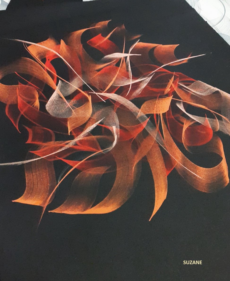
2018 November - Torino, Italy - Flame script
2019 February - Engelberg, Switzerland - birthday cards
2019 March - Zagreb, Croatia - Basic scripts
2019 June/July - International Calligraphy Conference - Montreal, Sherbrook University, Canada - Roman Capitals dry brush
2019 August - Scuola Grafica Venice, Italy - Stickers
2019 September - American Tour: San Francisco, USA (Rustic dry brush), Edmonton, Canada (exp. embossing), Boston, USA (brush Texturing)
2019 September - Bavarian monastery, Germany
2019 September - American Tour: Atlanta, USA, Vancouver Island (Textures), Kelowna (Textures), Calgary (Roman Capitals, Flames) - Canada
2019 November - Zagreb, Croatia - Basic pen scripts
2020 March - Zagreb, Croatia - Basic pen scripts
CANCELLED DUE TO COVID: 2020 April: American Tour: Indiana, Vancouver, San Antonio, Dallas, Forth Worth, Houston, Indianapolis
2020 All year: teaching online
2021 May - Online: Chicago Guild - Flame script
2021 June - Online: Portland - Flame script
2021 August - Namur, Belgium - Flame script, Carolingian script
2021 August - Zug, Switzerland - Birthday Cards)
2021 November - Zagreb, Croatia - Basic pen scripts
2021 November - Kriz - Croce, Italy - Chris. Cards, Experimental Illumination
2022 January - Online: England - Flame Script
2022 May - Staranzano, Italy - Embossing
2022 July - Pettenbach, Austria - Black on Black and crazy Illumination
2022 August - European Tour:
Scriptores Turnhout, Belgium (Textures & Flames), Namur, Belgium (Textura script), Saint Amand, France (Exp. illumination & Monoline scripts)
Namur, Belgium (Magic Circles, Black on Black, Crazy Illumination)
2022 October - Seengen, Switzerland (Flame Script)
2022 November - Online: IAMPETH conference, USA society - Dancing script
2023 March - Zagreb, Croatia - Basic pen scripts
2023 August - European Tour:
Turnhout, Belgium (Textures & Flames), Namur, Belgium (Neuland script), Lamorteau, Belgium (Flame script)
2023 October - Online: Texas Lettering for Holiday, USA
2023 November - Online: IAMPETH conference, USA society - Hand made lamps
2023 November - Online: Johannesburg, South Africa (Flame script)
2024 May - European Tour:
Mulheim, Nemčija (Flame), Namur, Belgium (Copperplate), Lamorteau, Belgium (Black on Black), Rouen, France (Flame Script)
2024 July - Hebdow, Poland (Fraktur dry brush)
2024 October - Apex Nancy, France (Flame script)
1. 2006 June – Mašun:
Various calligraphic techniques, from watercolour to illumination
2. 2006 July – National Gallery - A copy of initial letter “B” from Ms. 777
3. 2006 September – Gallery Riemer – Slovenske Konjice, Slovenia:
Various calligraphic techniques: from embosing to innovative family trees
4. 2008 December – Library of France Bevk – Nova Gorica, Slovenia:
Acrilic sgrafitto technique on big plexi glasses in various transparent colours, written in freestyle calligraphy…
5. 2009 November – Gallery Na Vogalu - Postojna - Acrilic sgrafitto technique on glass lamps
6. 2009 December - Library of France Bevk – Nova Gorica, Slovenia: - Acrilic sgrafitto technique on glass lamps
7. 2010 September – National Gallery of Slovenia
A copy of one folio from exhibited manuscript from Manuscripta exhibition and four inscriptions plus enlarge initials on walls
8. 2010 October – Library of France Bevk – Nova Gorica, Slovenia: Small innovative books in various materials and special calligraphy.
9. 2014 March - Stanislav Kregar Gallery - Big scale calligraphy on wood
10. 2014 April - Pettenbach - Schriftmuseum - Austria - Dry brush, wood, engraving
11. 2017 April - Westerloo - Belgium - Dry brush
1. 2008 July – Exhibition of Slovene Home and Artificial craft – Slovenj Gradec
Some examples of priceless commission for ordinary people and protocol gifts
2. 2010 March – CLAS Art and the Letter Exhibition – British Library, London, England
A unique lamp in sgrafitto technique, freestyle calligraphy - Awarded as most innovative calligraphy piece in exhibition
3. 2010 September – National Gallery of Slovenia - a copy of one of those manuscripts for people to touch and look closely to it.
4. 2011 October - Exhibition "Text in image", JSKD, Vipavski Križ, Slovenia
5. 2012 March – CLAS Art and the Letter Exhibition – British Library, London, England
an art work: »7 deadly sins« in 3D technique, embossed and illuminated
6. 2012 May – The Mobile Global Exhibition »Show your hope«, Foundation 80 Questions, Netherlands
7. 2012 October – In collaboration with a sculptor Andrej Kos: Exhibition: Unrevealed Stories
8. 2012 November – Group exhibition on a conference Focus Europa – »Europa Scriptorium« with 7 great European calligraphers: Jean Larcher, Katharina Pipper, professor Ewan Clayton, Margaret Morgan, Andrea Wunderlich, Helene C. Jenssen and Lieve Cornil
THIS EXHIBITION TRAVELLED ACCROSS GERMANY AND AUSTRIA IN 2013:
February 2013 - Film Fest kontrast, Bayreuth, Germany
March 2013 - Kunststraße Bad Berneck, Germany
April 2013 - Library Bayreuthu, Germany
June 2013, Schriftmuseum Bartlhaus, Pettenbach, Avstrija,
Sept. 2013 - Library Bayreuth, Germany, Presentation of works and project Europa Scriptorium by organiser Andrea Wundelich
Sept. 2013, History Museum, Bayreuth
October 2013, Art Academy Berlin, Germany
December 2013 - January 2014, Castle Plassenburg in Kulmbachu, Germany
9. 2013 March – CLAS Art and the Letter Exhibition – British Library, London, England
my innovative "underwater" oil sgrafitto technique in an art piece "She knows"
10. 2014 March – CLAS Art and the Letter Exhibition – British Library, London, England
11. 2015 July - The Passionate pen Conference, San Francisco, USA - faculty exhibition
12. 2016 March - Westerloo, Belgium - winning the 1st Prize
13. 2017 May - Painted words, Sebastopol Center for the Arts, San Francisco
From 2004 – some of my original copies of the founding document of the city of Bled from 1004 were exhibited at Bled Castle. My originals were used by the designers for the graphic image of the museum at Bled Castle. Client: National Museum of Slovenia
November 16, 2006-21. January 2007 at the exhibition ddr. Nataše Golob, Medieval Manuscripts from the Žička Carthusian Church (1160–1560) in the National Gallery, made a redrawing and enlargement of one of the initials from the exhibited manuscripts.
From 2008 – in the Museum of Christianity in Slovene, one original copy of one folio from the Stiš manuscripts is exhibited, in front of a scribe's doll, who bends over the manuscript. Client: Museum of Christianity in Slovenian
7. September – 7. November 2010
at the Manuscripta exhibition Book Painting in Medieval Manuscripts, I made an enlargement of four enlarged initials and calligraphic inscriptions on the wall and a transcription of one folio for educational purposes, so that visitors could have a close look at that time. Client: National Gallery of Slovenia
2018 - I made a copy of the document with the mention of Veronika Deseniška for the Provincial Museum of Celje in cooperation with the Archives of Slovenia.
1. September 2011 – Multimedia project "Dancefloor of Letters"
The 1st prize by Art University Nova Gorica - Slovenia. (in collaboration with Ales Bajec)
2. September 2011 – "Dance the Letters!" – Calligraphy dance performance, Slovenia (many repetitions)
3. December 2011 – Intervention in Space: "Birth of a Letter", Venice, Italy
4. May 2012 – »Tell me with Letters!", Slovenia
5. September 2013 – »Strings and Letters« - Acoustic guitar (italian guitarist Nazzareno Zacconi) with live calligraphy performance,
Slovenia (4 all unique repetitions) and Italy (Il Teatro Apollo)
6. July 2015 - "A day of a calligrapher" - Calligraphy conference "The Passionate pen" at Person Theatre, Sonoma, San Francisco USA
7. April 2016 - Performance at Scuola Grafica, Venice
8. August 2016 - "A day of a calligrapher" - Leeds, CLAS Calligraphy conference
9. September 2016 - Performance in Rennes, France - for a printing company Hauts de Villaine
10. October 2016 - "A day of a calligrapher" - Mexico City, at a giant Paperstore Lumen
11. November 2016 - "Moj službeni dan" (My day at work) - Kulturni dom Ajdovščina
12. February 2017 - Performance - Calligraphy conference Letters California Style, Los Angeles
27 - 30. June 2017 - Shooting for a for GUINNESS beer advertisement
14. October 2017 - Performance - Calligraphy workshops in Calgary and Ottawa and Mexico City
24. June 2019 - Vilnius, Lithuania - "A day of a calligrapher" performance
Loredana is a devoted freelance calligrapher and an artist from Slovenia in Europe who is blessed with a lyrical first name from Italian heritage. I have been watching her journey since her days at CLAS, and delight in knowing that there are such talented young letter artists who are so enthusiastic about embracing their skills and stepping outside the box. Loredana has hit the floor running, or should I say, she is literally dancing... all around the world...with her fresh approaches and passion for letters...
Interview with Julie Williams - for Australian Colophon magazine
JW: Loredana, tell us a little about yourself...
Calligraphy is my passion for almost 26 years now! My aunt studied design and my family received lots of greeting cards written calligraphically... I was really dying to see those magical letters! (as I still do) So I started to learn calligraphy very early. But in those times it was really hard to buy something as special as a calligraphy pen. So when I was on a dance competition in Denmark I bought my first one and at this point my painful (!) way of self learning really started. I was quite a strict teacher to myself and I had a passion to achieve perfection. My first alphabets as templates came from my aunt, but soon they were not precise enough for me. So, the next step were fonts! I printed out a letter at a time and started to practice. I discovered lots of things by myself and this knowledge is priceless and firm.
After finishing high school in Slovenia, I figured out that I could turn my hobby into business and
so I started to write exercise books for teaching calligraphy and became a freelancer at the age of 21. Through teaching I gained a lot of practical knowledge, but that wasn’t enough for me. I found
an organisation which holds an English National diploma in Calligraphy and organises calligraphy
master classes (The Calligraphy Lettering Art Society - CLAS - London). My first was with Denis
Brown in 2007. I finally gained the National Diploma in Calligraphy in 2007 intermediate level and in 2013 – advanced level, passed with distinction. For the last 16 years I’ve been working for many
private clients and institutions besides teaching and exhibiting worldwide.
JW: What type of calligraphic work do you most enjoy doing?
Hmm... there are lots types of calligraphic work that I enjoy... but most of all I enjoy doing live performances. In those I can include my other passions like theatre, dance and singing, which is really fulfilling. That is why I wrote my Musical “A day of a calligrapher”. I also really enjoyed shooting a commercial for Guinness beer in London (2017)...
Commercial for the GUINNESS beer
JW: We would love to hear about any interesting calligraphic projects you have worked on recently. Tell us about them...
Onee of my favourites is a big performance in Rennes (France), where I wrote large inscriptions on the floor and created a giant calligraphic piece on stage. An unforgettable experience...
Click here... Performance in Rennes, France
JW: Can you describe the time when you first realised that creating calligraphy/ lettering was
something you absolutely had to do?
When I saw calligraphy written diplomas or hand written posters in the library or like I mentioned - my aunt’s cards, I was just blown away and I just kept staring at them. But as I had also many different hobbies in adolescence the choice of being professional calligrapher was really a decision at the age of 18, I guess. I could be a professional dancer, too!
JW: Describe a real-life situation that inspired you...
Oh, there was a workshop in Haus Werdenfels, Germany. My first international... And the last evening they prepared me a big wall covered with paper and said: “So, Loredana, please let us see how you dance with your biggest brushes!” And they made a terrible mistake... they gave me a glass of wine - a mistake!! And I started to enjoy myself writing backwards – like Leonardo daVinci, imitating the voice of Jean Larcher how the copperplate should be written, explaining why the Rustica script is impossible to learn... and so on and on...
It was really great show, with a great supportive audience and in one moment I knew this would become my Musical for the 34th international calligraphy conference in San Francisco! The next day I started to write the concept and in the next months I changed the text of 6 well known rock songs into calligraphy themes, went into a music studio and recorded them. I wrote all the text that I am speaking on the stage, made choreography for dancing, recorded 2 new videos and finally prepared all the calligraphy inserts that I create on the stage live. Quite a huge work, but really enjoyable, especially because it was premierely played in Person Theatre (San Francisco) in front of 400 calligraphers - during the The passionate pen conference in 2015. This musical I dedicated to a great Calligrapher, and a friend - Jean Larcher...
JW: Where do you find inspiration for your work?
My inspiration is absolutely nature... being there – in the woods, drinking water from the creeks, breathing the fragrance of the rain and dancing among the snowflakes – artworks by themselves. The inspiration is a freedom of a running Samoyed, his smile and joy...then my heart is full of inspiration, happiness and gratitude.
JW: Do you have a dream project?
I would love to create my musical in collaboration with dancers, singers and other artists – to make it really special and then play it in some biggest theatres. And the other one: I would like to create a giant calligraphy art piece on a façade of one high building- maybe in Dubai... :) I guess Dubai would be my dream place for a special performance or an exhibition!
JW: What are the 3 most indispensable items in your studio?
A high quality brush, a gouache and a really good paper. That’s all I need to be happy!
JW: What is the best advice you’ve been given regarding calligraphy or arts practice in general?
It was about blank spaces from Denis Brown. It is about the harmony of the spaces between letters and words... Artur Schnabel once said: “The notes I handle no better than many pianists. But the pauses between the notes - ah, that is where the art resides.” It is the same in calligraphy or in dance.
JW: How do you feel about the role you consider a calligrapher has these days in society?
Do we still have a reserved place in heaven? ;) Well, one big impact as a calligrapher made Herman Zapf, who created gorgeous fonts that I meet on every step around the world. I feel that calligraphers should have a bigger role especially nowadays. Bringing back a handwriting culture, a visual consciousness, a sense of beauty, proportions and finally, through practising the letters, a contact with
ourselves.
JW: What do you like most about your involvement with calligraphy?
Most of all the freedom that I have in my life. That I can do whatever I want to do. Sometimes it can be hard to be your own boss, of course. Calligraphy offers me a stage where I can express all of my passions.
JW: Is there a calligrapher whose work has inspired you...what is it about their work or approach that you admire?
Hmm, only one? Laurent Pflughaupt is in the first place for sure. I admire his way of design, changing the scripts from traditional to top modern and still maintaining the perfect stroke, using the materials and techniques on a very high level. He is my true inspiration.
JW: How has your calligraphy practice changed over time?
In the first 7 years of freelancing my progress was so evident, that I couldn’t see my calligraphy from a month ago! Then it slowly got better, and this was Denis Brown’s fault! Then the development rapidly increased... there were some crucial moments that changed my calligraphy practice. One was Europa Scriptorium conference in 2012, creating beside the great Jean Larcher and to whom I dedicated my Musical. Some moments from the conference Europa Scriptorium. There I started to use a brush technique. Then I think it was a gorgeous Carl Rohr’s workshop
where I met W&N 995 brush and got inspired of so many different ways of writing he showed us. That was in Regensburg, Germany and the organizer invited me to teach the next year’s workshop – my first international. After that I really mastered the brush and it became my top tool. I dedicated a song to it. Rolling on the river (Tina Turner) became Rolling with a brush, yeah... :)
JW: Do you have any words of wisdom for those starting out on their own calligraphic journey?
Nobody is born as an artist (or calligrapher) but with a passion for it. And this love gives us energy to exercise and to dedicate our time to do what we love. This is a recipe: hard work, self discipline and lots of self criticism...
Author of the interview: Australian calligrapher - Julie Williams
+386 31 370 486
Loredana Zega
Lokavec 132
5270 Ajdovščina
SLOVENIA
preprosto.jaz@gmail.com
15.000 let pr.n.š.
Foto: Poslikave v jami Lascaux v Južni Franciji, vir: Wkipedia
Že dvajset tisoč let pr.n.št., v času paleolitika, so v kraški jami Lascaux (južna Francija) nastale stenske slikarije, ki so se ohranile vse do današnjih dni. Šestnajst tisoč let pa je moralo miniti, da se je pričela prečudovita zgodba o pisavi.
» Medtem ko se ljudje že milijon let rojevajo in umirajo, pišejo šele šest tisoč let.« - Etiemble
» Pisava v pravem pomenu besede nastane šele v trenutku, ko je organiziran sistem znakov ali simbolov, s katerimi lahko zapišemo vse, kar mislimo in čutimo.« (Georges Jean, Pisava, spomin človeštva )
Zgodba o pisavi se začne med Tigrisom in Evfratom, v Mezopotamiji. To območje je bilo med šestim in prvim tisočletjem pr.n.št. razdeljeno na Sumersko (na J) in Akadsko državo ( na S), njuni prebivalci pa so govorili dva zelo različna jezika.
Najstarejši znani pisni zapis je iz 4. tisočletja pr.n.št. - to je tablica iz Uruka, na kateri so razbrali računski zapis. Razvili so PIKTOGRAME, ki predstavljajo določen predmet ali bitje, s povezovanjem le teh pa so lahko izrazili celo misli.
Foto: Sumerščina je bila zadnji in najstarejši jezik, ki so ga razvozlali.
Napis na tablici: Prodaja številnih njiv, verjetno iz Isina, okoli 2600 pr.n.št. Vir: Wikipedia
3000 let pr.n.št. so piktogrami izginili in pojavil se je KLINOPIS. Ime je dobil po značilni obliki znakov, ki so bili podobni klinom. Uveljavil se je šele, ko so Akadci zavladali nad vso Mezopotamijo (2000 let pr.n.št.) in omogočil, da so lahko zapisali vse, čemur lahko rečemo književnost. Toda kljub razvoju je pisava pomenila privilegij in oblast, saj pisanje in branje klinopisa ni bilo preprosto. Tako so bili pisarji včasih vplivnejši od nepismenih dvorjanov ali celo od samega vladarja.
31 stol. pr.n.št. - 2. stol. n.št.
3300 pr.n.št. - 200 n.št.
Foto: Hieroglifi na steli v Louvru, okoli 1321 pr.n.št. Vir: Wikipedia
Medtem, ko se je v Mezopotamiji razvijala klinopisna pisava, so se v Egiptu pojavili HIEROGLIFI (gr. za "svete rezbarije" ali pisava bogov). Prikazovali so poenostavljene podobe človeka, živali, rastlin in so v nasprotju s klinopisom, ki je tog ter geometričen, prav lepi in očarljivi.
Pisavo so enako kot v Mezopotamiji, uporabljali v računovodstvu, vzpostavitvi pravnih pravil in celo za književnost. Iz rastline Cyperos Papyros, ki je rasla v močvirjih delte Nila, so izdelovali stvari za vsakdanjo uporabo ( vrvi, sandale, jadra...), iz njenih vlaknatih stebel pa so pripravljali pisno podlago, ki je prinesla pravo revolucijo na področju pisanja - papirus.
To pisno podlago so uporabljali že od 3. tisočletja pr.n.št. Nanj so pisali s trsteno paličico, ki je imela kovano ali prirezano konico, za črnilo pa so uporabljali sajasti prah, vodo in utrjevalec - gumiarabikum. Najdaljši zvitek, ki se je ohranil, meri kar dolgih štirideset metrov...
Papirus so izvažali celo v Sredozemlje in tako je kmalu dosegel vrtoglave cene. Kot pisno podlago so uporabljali cenejše apnenčaste kamne, keramiko in celo usnje, ki pa je bilo še dražje kot sam papirus. Nanj pa so pisali samo najdragocenejša besedila.
Foto: Odtis napisa starih kitajskih pismenk vrezanih v bron, iz dinastije Zhou iz okli 825 pr.n.š., Vir: Wikipedia
Prav na drugi strani sveta se je nekaj tisoč let pr.n.št. Kitajci razvila pisava, ki jo berejo in pišejo - skoraj nespremenjeno- še danes!
Zgodba o pisavi se je skoraj pri vseh ljudstvih pričela enako - z risbami in piktogrami, ki so se najbolj ohranili prav v KITAJSKIH PISMENKAH, kar daje kaligrafiji te pisave prave umetniške razsežnosti.
Na Kitajskem so tudi prvi odkrili PAPIR. Po pisnem izročilu je CAI LUN, dvorjan kitajskega cesarja, iznašel papir okoli leta 105, novejše raziskave pa kažejo, da so ga poznali že leta 49 pr.n.št.
Torej, če povzamemo; klinopisi, hieroglifi in kitajske pismenke, imajo skupno to, da so sestavljene iz celih besed ali zlogov, za kar je potrebno poznavanje velikega števila posameznih znakov ali pismenk.
konec 2. tisočletja pr.n.št.
od okoli l. 1050 do 150 pr.n.št.
Foto: Feničanska abeceda, na steli Mesha (moabitski kamen), Vir: Wikipedia
Pri ČRKOPISU lahko zapišemo s tridesetimi znaki takorekoč vse.
Začetniki črkopisa - Feničani so bili večinoma trgovci in pomorščaki. Tako so ga začeli širiti po vsem vzhodnem sredozemlju. V 8. stoletju pr.n.št. je na mestu današnje Sirije (Arameja) nastal » aramejski črkopis«, zelo podoben feničanskemu. Pomemben je predvsem zato, ker je bil večji del Stare zaveze napisan prav v omenjenem črkopisu. Vsi ti črkopisi so vsebovali le soglasnike, saj so samoglasniki igrali le majhno vlogo v jeziku.
Torej, ko so si aramejsko pisavo izposodili Grki, so si jo priredili in nastalo je še sedem samoglasnikov. Za pisno podlago so uporabljali papirus, voščene tablice ali cenejšo keramiko. Voščene tablice, kot že samo ime pove, so bile prekrite s tanko plastjo voska, na katerega so pisali s šilom ali črtalniki -gr. Stylus. V 5. in 4. stoletju pr.n.št. je v grškem črkopisu nastala ena najčudovitejših in najbogatejših književnosti vseh časov (Odiseja, Ilijada...)
Foto: Napis vklesan na dnu Trajanovega stebra v Rimu, dokončanega okoli 113 n.š. Primer najlepše rimske kapitale vklesane v kamen.
Vir: Wikipedia
Iz grške pisave so nastale zelo zapletene pisave in verjetno tudi rimska abeceda, ki je najverjetneje prednica naše pisave. Okrog 3. stoletja pr.n.št. se je oblikoval latinski črkopis. Rimljani so uporabljali velike črke - RIMSKO KAPITALO, pa tudi RUSTIKO za vklesovanje v kamen, male črke (RIMSKO KURZIVO) pa so uporabljali na drugih pisnih podlagah.
Rimska kapitala je ena najvplivnejših pisav, ki je preživela 2 tisočletji in se še danes uporablja za v oblikovanju (naslovnice, Filmi...) ter vklesovanje v kamen (napisi, nagrobniki...) Skozi stoletja so jo različni mojstri "secirali" do potankosti, saj so želeli vedeti, po kakšnem geometrijskem načelu so jih Rimljani klesali v kamen. Šele v 20. stoletju je to uspelo duhovniku Edwardu Catichu (r.1906), ki je znan po razvoju teze, da Rimska kapitala dolguje svojo obliko, vključno s serifi, uporabi ploščatega čopiča. Njegova najslovitejša knjiga, ki je kaligrafom še danes najbolj v pomoč: Izvor serifa (The Origin of the Serif)
od 200 pr.n.št. do danes
1. stol. pr.n.št. - 3. stol. n.š.
Foto zg.: Stara rimska kurziva, Vir: Wikipedia
Foto sp.: Priročnik za grško in latinsko paleografijo -
v Arhivu sv. Petra v Rimu iz leta 500 n.š.
Iz Rimske kurzive sta čez čas (v 2. in 3. stoletju n.št.) nastali POLUNCIALA (na otoških predelih Evrope: Anglja, Irska) in UNICIALA (zelo velika okrogla pisava, ki so jo uporabljali predvsem za prepisovanje Biblij), ki sta se razširili na vse dele tedanje Evrope, poseljene z Rimljani (do leta 1000). ANTIČNO KVADRATIKO ter RUSTIKO so uporabljali za naslove in inicialke oz. začetne črke pri vseh pisavah do razvoja Gotice.
Skozi stoletja se je torej pisalo le v latinici in šele okrog 9. stoletja so začeli uporabljati tudi ljudske jezike (staro nemščino in francoščino).
Foto: Folio14 recto Vergilius Romanus - vsebuje avtorski portret Vergilija.
Vir: Wikipedia
Rustiko so uporabljali med 1. in 9. stoletjem. Po 5. stoletju pa so te velike črke začele izpadati iz uporabe, vendar so se še naprej uporabljale kot pisava v naslovih in skupaj z uncialo kot pisavo glavnega besedila.
Sprva so pisarji prepisovali na papirusne zvitke - lat. VOLUMEN, toda ti so bili zelo dragi, občutljivi in lahko so jih popisali le po eni strani. Med drugim je bilo iskanje besedil na zvitkih težavno delo.
med 1. in 9. stol. n.št.
od 4. do 8. stoletja našega štetja
Foto: Detajl iz žepnega Gospela Sv. Cuthberta - primer Unciale iz zgodnjega 8. stoletja. Vir: Wikipedia
Tudi Unciala, tako kot Rustika in Rimska kapitala, je majuskulna pisava - v celoti napisana z velikimi tiskanimi črkami, ki so jo običajno uporabljali latinski in grški pisarji od 4. do 8. stoletja našega štetja. Uncialne črke so bile uporabljene za pisanje latinščine, pa tudi grščine.
Umetnost pisanja in ILUMINACIJE - okraševanja, pa se ne bi nikoli tako razširila, če ne bi prišla v rabo nova pisna podlaga - PERGAMENT. Le ta je navadno iz ovčje, telečje ali kozje kože. VELIN (fr. Veau- tele), ki je bil iz telečje kože, je veljal za najboljšega, ker ni vpijal črnila in je najbolje ohranjal barvo. Tako se je lahko začela oblikovati tudi nova pisava, ki je dopuščala bolj okrogle linije, kot hrapav papirus.
Foto levo: Srednjeveški pergamentar, Stadtbibliothek Nürnberg, Amb. 317,2°, fol. 35r Vir: Wikimedia
Foto desno: Marjan Petač, z luno v rokah ter mojimi izdelki na njegovem pergamentu, Vir: https://portal-os.si/
Pergament naj bi iznašli v Mali Aziji predvsem zato, ker so se Egipčani v 2. stoletju pr.n.št. uprli izvažati papirus v Pergamon (glavno mesto Male Azije). Tako so se ti morali zateči k novi surovini - živalskim kožam. Po mestu Pergamon je ta nova pisna podlaga dobila tudi ime.
Pri nas ga po starih postopkih izdeluje Marjan Petač. Njegovo delo je prestopilo slovenske in evropske meje. Naročajo ga arhivi in knjižnice iz celega sveta. Če potrebujete pravi pergament, je to pravi naslov za vas :)
FB @marjan.petac e-mail: pergamentpetac@gmail.com
Kje še lahko vidite njegove pergamente in moje prepise listin:
Grad Bled (prepis delov listine o ustanovitvi Bleda)
Pokrajinski arhiv Celje
Muzej krščanstva, Stična...
od 263 pr.n.št. do 15. stol. n.š.
Foto: Codex Zacynthius je najstarejši rokopis grške Nove zaveze, ki vsebuje spise zgodnjekrščanskih teologov in svetopisemsko besedilo. Rokopis je bil prepisan okoli leta 700 in vsebuje Lukov evangelij
Vir: https://www.cdh.cam.ac.uk/research
Pergament je pomenil veliko spremembo v svetu pisave, saj je zamenjal nepraktične papirusne zvitke. Pergamentne liste so lahko šivali in prepogibali. Tako je nastala prva knjiga - RIMSKI KODEKS. Z novo pisno podlago so začeli uporabljati gosja peresa, ki so omogočala nove razsežnosti v obliki in kakovosti.
Kodeks (iz latinščine codex; slovensko blok lesa oz. knjiga; mn. codices) je ročnopisana knjiga, ki je nastala v času med pozno antiko do novega veka.
Foto zg.: Peresa iz trstike, Vir: British museum
Foto sp.: Gosja peresa, Vir: web.ceu.hu
Postopek izdelave peres za pisanje sem ustvarila za Muzej Krščanstva na slovenskem, v Stični. Če jih obiščete, boste videli tudi moj prvi prepis listine na Marjanovem pergamentu, v sklopu stalne razstave Skrivnostni svet srednjeveških pisarjev.
Best AI Website Maker